National Food Security App
Summer 2023Lead Product Designer
Gro Intelligence
Problem
Government agency decision-makers need a way to efficiently monitor and analyze all the data indicators that relate to food security in order to identify supply chain risks and make informed policy decisions.
But their current systems are disconnected and require expert knowledge to spot early warning signals of food security risks.
This leads to reactive, not proactive management.
Pain POints
To understand users' needs, I started by reviewing prior research I had done with Procurement specialists who are the private-sector equivalent of these government users. Plus, given my experience in government agencies myself, I could empathize with the challenges of data overload.
I identified a few key pain points:
Data lives in silos across different agencies and databases
No holistic view of national food security posture
Difficult to analyze trends and risks
Lack of early warnings leads to reactive decisions
The client
Our client, a government agency, needed a way to monitor key food security indicators and get early warnings to take action.
I was the UX lead on the project, so I set out to design an app that consolidated their data sources into one place.

Key Insights
Two key insights emerged quickly:
Users needed a portfolio view of commodities to summarize risks and surface alerts.
If a user saw a risk, they would want to know what was driving it. So, each element of food security risk - climate, economic power, and production/consumption flows - needed its own breakdown page.
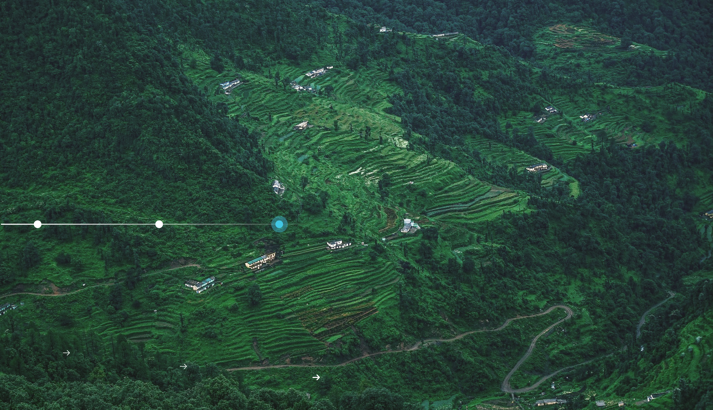
A trade view was also critical, since the country in question depends heavily on imports.
Design Principles
With tight deadlines, I had to move fast. But I focused on key elements that brought together data visualization practices with UX and product design like:
Intuitive visualization of complex data. Interactive charts, graphs and maps helped users digest volumes of information at a glance.
Clear information hierarchy - Thoughtful prioritization and placement of data modules guided users to what mattered most.
Modular framework - Customizable components enabled agile response to evolving user needs.
Layered data insights - Users could toggle different data lenses on maps to uncover relationships.
Automated risk alerts - Visual flags, highlights and notifications enabled proactive risk management.

Solution
The resulting app provides:
A clean, engaging dashboard with our proprietary Supply Risk Scores.
A portfolio view across commodities.
Crop calendars for each trading partner to provide an indicator of how urgent any risk was to the overall national security posture.
Custom weighting of risk by trade relationships, which directly surfaced the country’s exposure to supply risks.
Key Takeaways
Early user research uncovered needs we wouldn't have otherwise realized.
Planning ahead for modularity and scaling was time well spent.
Balancing visual appeal and rapid development was key to getting in the door with the client at all.
Nobody - not even governments - quite know how to measure food security, so there is huge opportunity for blue-sky creative thinking in this space.
other works
-
![The USGS Water cycle diagram.]()
USGS Water Cycle
-
![A magazine spread featuring an article called "The Lines that Guide Me"]()
Nightingale Magazine
-
![A figjam board with stickie notes]()
Design Team Leadership
-
![Beeswarm Chart of sperm donor distribution by race and height.]()
Sperm bank gene pool


